Your cart is currently empty!
5 artefacts that inspired Mulan’s designer

There are always 2 sides to a coin. Even for Mulan. While the production team’s taste is questionnable, they didn’t squander their 3 week study trip to China entirely either. There are several easter eggs in the show where I could tell exactly which artefact they might have been inspired by, and it’s quite fun to spot them! So let’s have a look and learn a bit more about these otherwise neglected gems!
1. The Army & their Armour
Personally, when it comes to Tang dynasty costumes for a show, you have to watch the Longest Day in Chang’An (2019 Chinese Drama). That, is probably the gold standard. They had plenty of armours made for the show, just like Mulan, and I thought it’s fun to also compare the 2 shows as well as the artefacts that they are based on.
The one in “Longest Day in Chang’an” featured armours that used around 6,000 individuals pieces to make so as to be as functionally similar to the original as possible. The one in Mulan, I guess due to time constraint (even though they have a huge budget), could not be done that way, so they opted for a more decorative/flat kind of texture, look and feel. And I suppose borrowing from the Longest Day in Chang’an wasn’t an option cos they were filming around the same time (also another reason why the Chinese drama had to build its own set, which worked out pretty well for them actually).
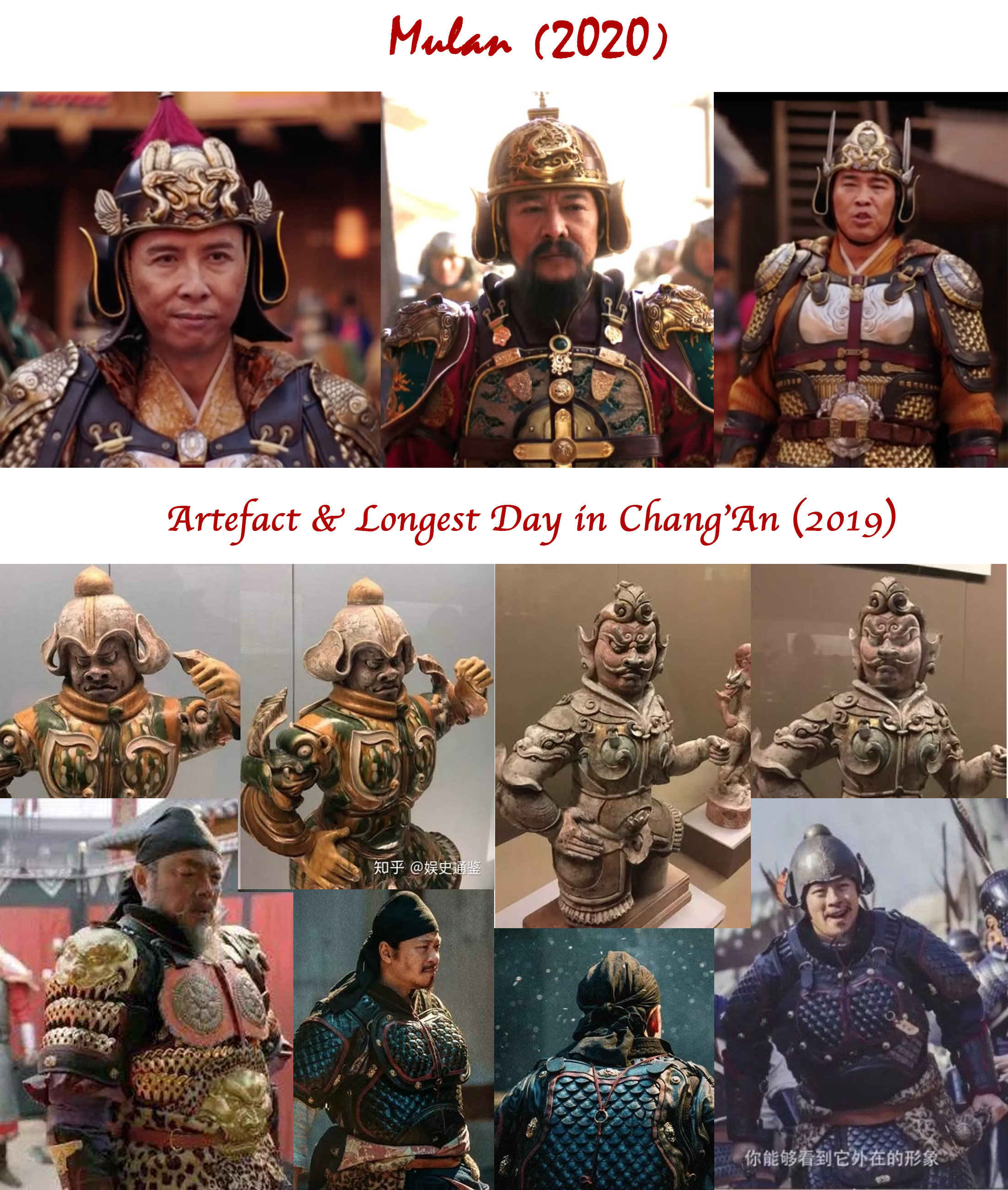
That being said, a lot of effort has definitely gone into replicating the look of a Tang army in Mulan and you can read about the details of the armours HERE. A few visual comparisons below:
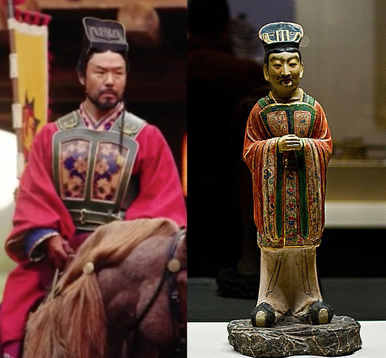
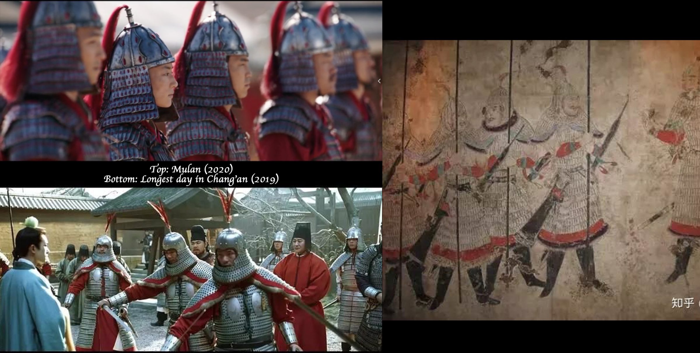
Since I’m not an military fashion expert, I’ll say it gets an overall score of 8/10 from me.
2. Emperor’s not-so-new clothes
Since ancient dynasties in China, what the emperors wore for the various occasions have been codified to 6 different types and most of the periods thereafter followed what was dictated in the Rites of Zhou (circa 8th century BCE). In Tang dynasty, such categories further expanded to 12 different types of dressing for variousi functions and occasions.
I am kind of impressed that they got his formal wear almost right, especially the hat:
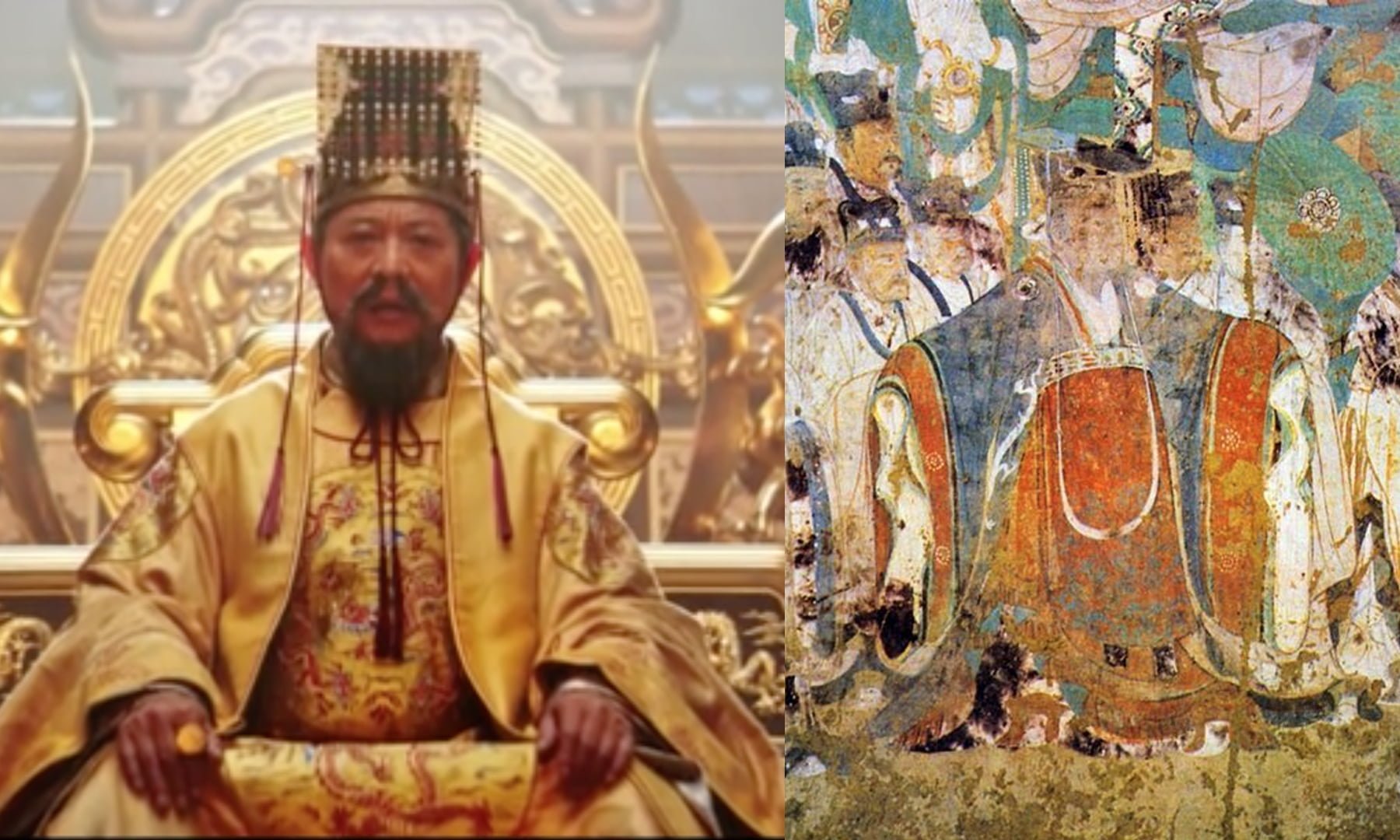
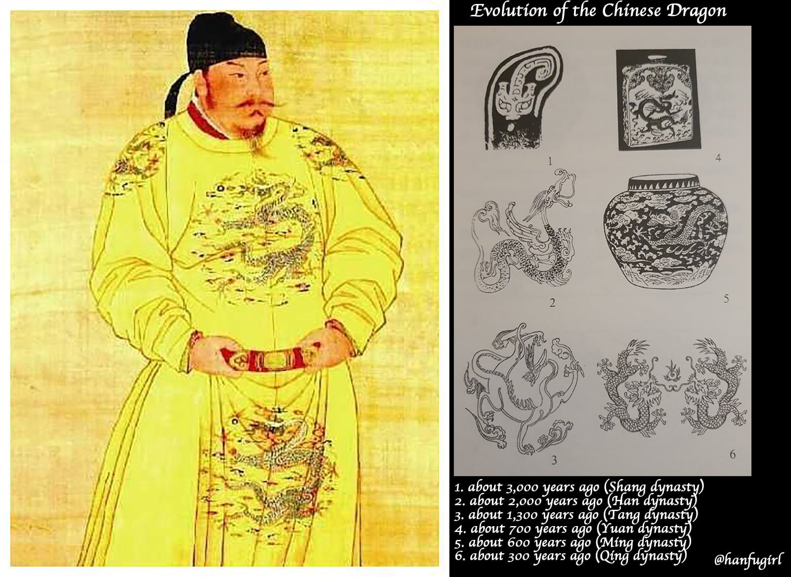
Almost, because the devil’s in the detail. The formal wear is supposed to be like what’s depicted in the painting on the right, but I can understand that the stereotype of Chinese emperors would be someone who looks like the Chinese Jade Emperor, and that yellow is the ultimate colour for emperor:
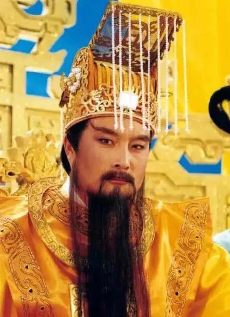
I believe it was a genuine mistake by the production team, because Tang dynasty was the beginning of the practice where yellow (note: but only a the orange/reddish yellow not all shades of yellow) was reserved for the emperor. It’s a myth that yellow has always been reserved for the imperial family, because before that anyone could wear it and even in Tang dynasty, many could still continue to do so, in fact yellow was stated alongside with white as colours for civilians. The ceremonial dresses however, were not subject to this yellow criteria, since they followed the Rites of Zhou and during that period, Black and Red were far more superior colours.
They might have taken inspiration from this portrait of the Tang emperor except that this painting wasn’t done in Tang dynasty but much later (I would say Ming/Qing dynasty) and you can just look at the evolution of the dragon motif to tell:
The hat, I suppose was based on a Ming dynasty artefact belonging to the son of the emperor, and the only surviving artefact of this type of crown:
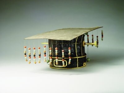
So it’s actually somewhat impressive that they got the number of beads in the crown right and its varying colours! I mean, many Chinese shows would’ve just have random number of beads in white or whatever colour that look nice. I’d give this a 8/10 for its attention to such an obscure but impressive detail.
3. Phoenix emblem
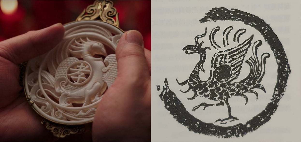
Right: Western Han dynasty Zhuque (Red bird/fire bird; Note: NOT phoenix)
I know I know, could phoenix be a variation of the zhu que red bird? It certainly seemed so except that in ancient Chinese texts they were two markedly different species. The Phoenix is supposed to have 5 colours, while the red bird is, as its name suggests, red. The Zhu que/Red bird is one of the 4 guardians in Chinese culture, but it was usually used on the roof tiles instead of as what the movie suggested, at the two sides of the front entrance.
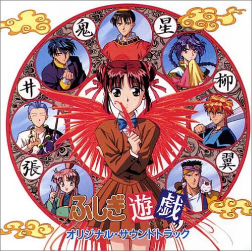
The ancient Chinese divided the world into 4 quarters of the world and assigned a guardian creature to each of them to balance and control the evil forces of the world. One of my favourite childhood Japanese anime was based on this concept–Fushigi Yuugi. And yes, the 4 gods were made up of a total of 28 constellations thus the anime had different constellations assigned to the respective guardian gods.
The most iconic motifs of the 4 guardians/gods are none other than the Western Han dynasty roof tiles:
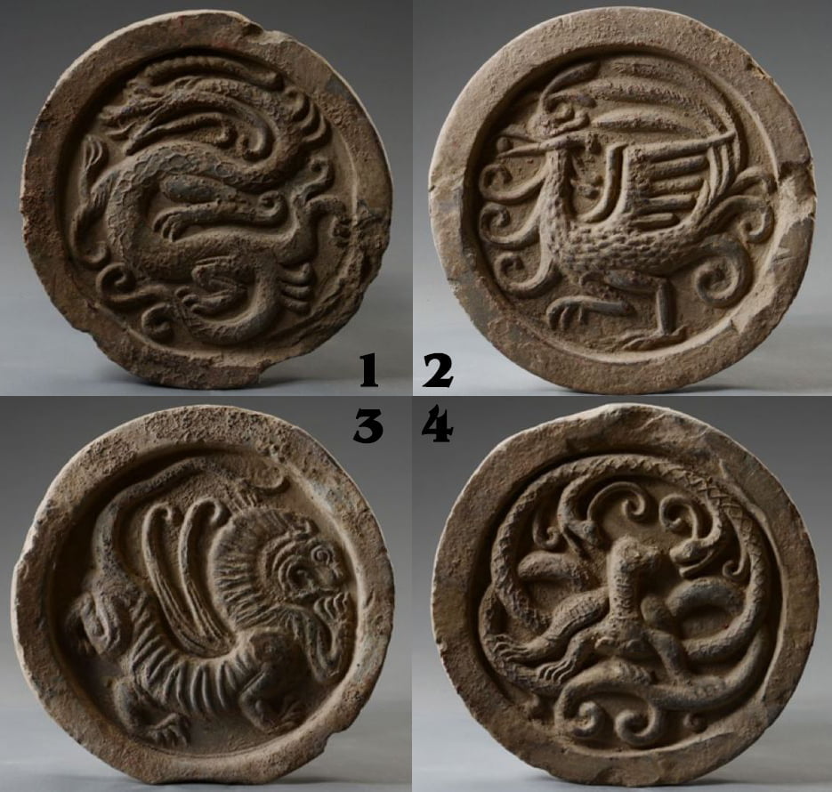
2. Red bird of the South
3. White tiger of the West
4. Black Turtle-Snake of the North
The element that is associated with the Red Bird is fire, but overtime people confused the phoenix and the red bird, and today most people thought of them as the same creature.
Maybe one day I should do a series on the 4 guardian gods and their respective constellations.
Whether or not intentional, it reveals an effort by the Mulan team to base their design on an iconic Chinese motif and artefact, and for this, they get 9/10 from me!
4. Madame Matchmaker’s hair woes
I know, I know, the matchmaker looks like a clown in Mulan, but upon close scrutiny, it was just an unfortunate combination of many artefacts into one. In a way it is not unlike the ancient Chinese mythological beings which were made up by combining several creatures into one. Taste, is a different matter altogether.
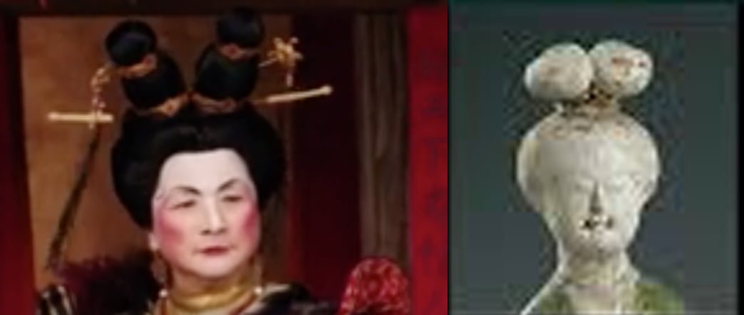
There are many ways to skin a cat, and somehow the Chinese show’s way is more aesthetically pleasing to me:
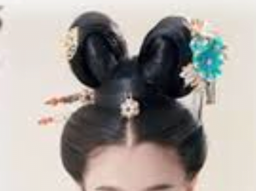
This design doesn’t get a pass from me due to its poor attention to detail and poor sense of aesthetics. Villains don’t need to look like lunatics.
5. Advisor’s fancy wardrobe
The advisor’s wardrobe has some serious attempt at Tang design like the one on the robe he wore when he was possessed. It was actually a very quintessentially Tang dynasty flower medallion.
The top is a Tang dynasty rug made of wool, currently in the Textile collection of Shosoin in Nara, Japan.
The bottom is a piece of Tang dynasty fabric in the Met Museum collection.
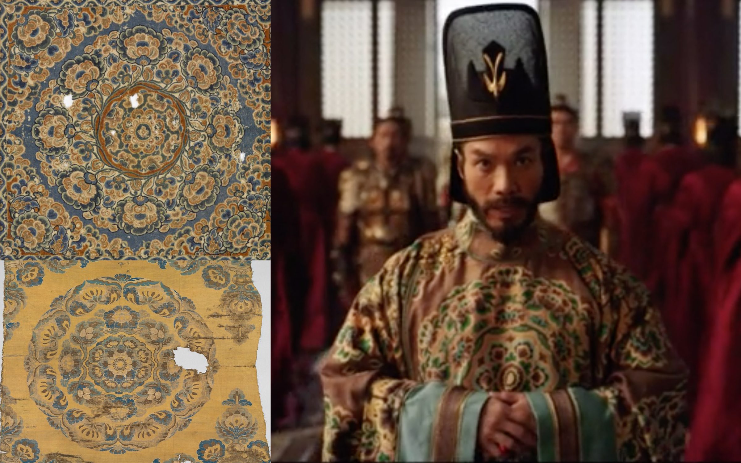
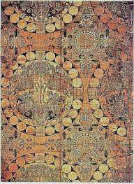
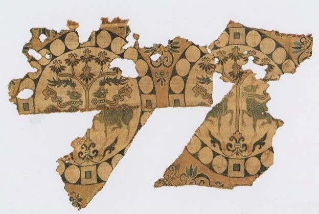
The advisor has another top that has a pseudo Tang-inspired motif, the roundel design. Although, I have to say that it is quite poorly painted/designed, looking like a child’s scribble than the more stylised and less convoluted style which it is probably based on:
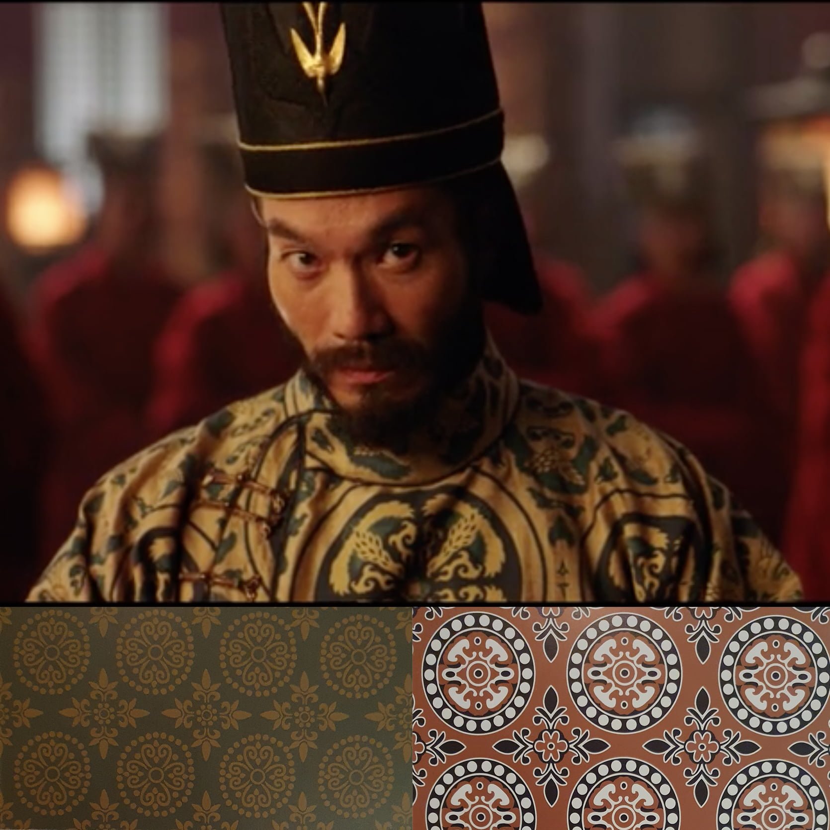
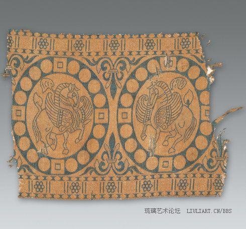
Such roundel designs and the flower medallion designs were quite unique to the Tang dynasty textiles. Although it was a continuation from the Northern dynasty hundreds of years prior, it was very popular during the Tang dynasty thus making it very iconic of the period.
There are so many fine examples of such roundel motifs:
And the flower medallion designs from the Tang dynasty (super gorgeous I know):
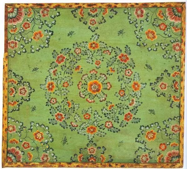
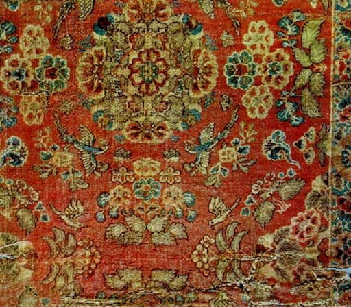
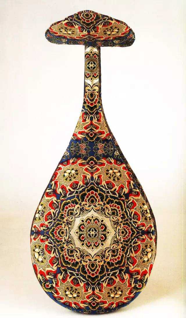
Because they bothered to dig up some of the really iconic motifs of Tang, and even though it is poorly executed, it was not as awful as the matchmaker’s hair, so this is probably a 5/10.
One of the most iconic aspect of Tang dynasty is, as the designer/filmmaker mentioned, its use of colours. As you can see from the artefacts, they have such complex designs made up of very strong and contrasting colours, yet they look really balanced together.
The film, however, lacked that sense of harmony despite its attempt at having really strong colours. It’s something I can’t quite explain, perhaps it’s the synthetic colourings used, or maybe the designer really didn’t have a good understanding of the ancient Chinese aesthetics, or maybe it was just different taste from mine.
It is also a lost opportunity for the Mulan PR team to talk about the artefacts they were based on, and make it educational and meaningful instead of just a brief mention of the Tang aesthetics being colourful and nice.
Leave a Reply